

Crafting a Mobile Compare Experience
Lead Designer | Co-Researcher | 1 Quarter
Crafting a Mobile Compare Experience
Lead Designer | Co-Researcher | 1 Quarter
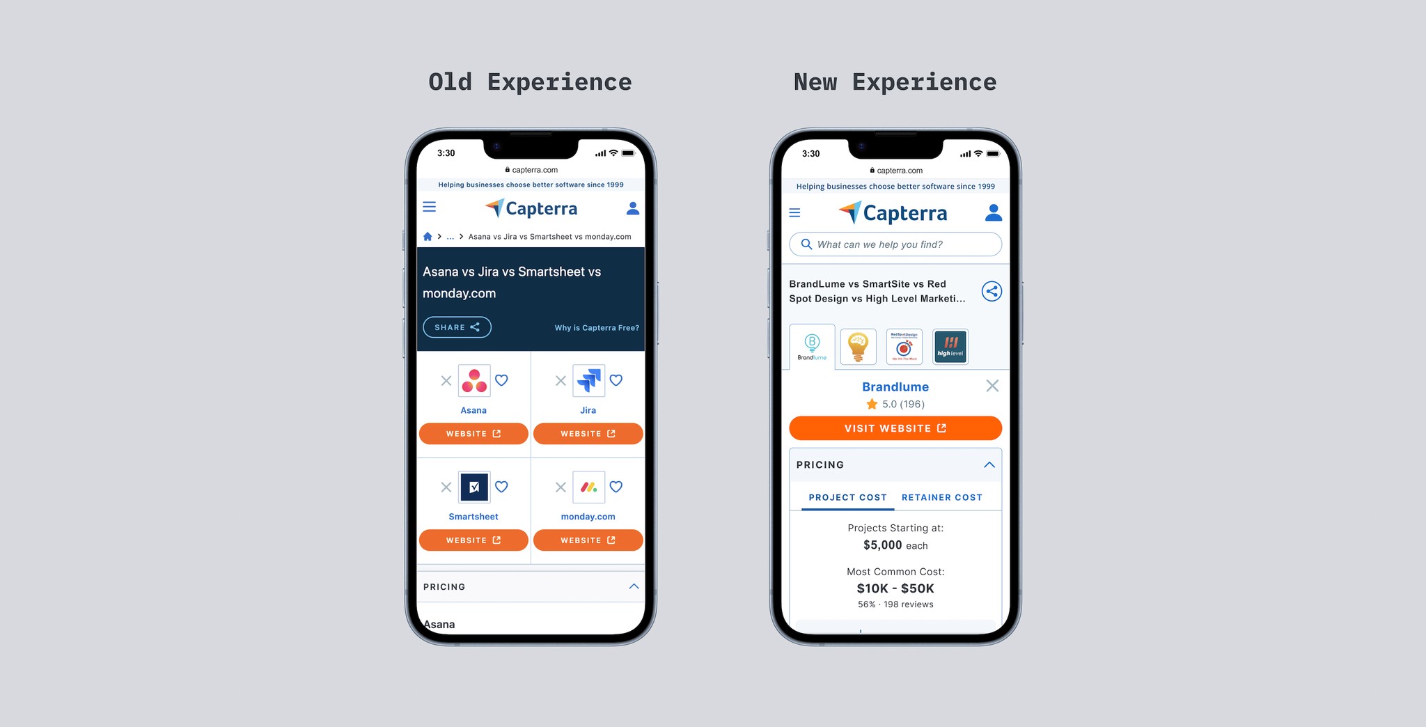
The Mobile Compare Problem
Side-by-side feature comparison tools are an invaluable way for users to quickly differentiate between products that might otherwise seem indistinguishable. At Capterra, our software marketplace has long provided this tool to our users, but its initial implementation had several key usability issues. Specifically, our mobile experience was often seen as cumbersome and didn’t match our users mental models on how side-by-side comparisons should work. This made a lot of sense seeing how our compare tool shifted to a vertical layout on smaller breakpoints. From a technical standpoint, this implementation makes since due to the limited horizontal space on smaller screens. However, users encountered difficulties in quickly comparing features in smaller viewports.
The Mobile Compare Problem
Restore Hyper Wellness, an award-winning pioneer in the wellness field, has revolutionized the industry by introducing an innovative category of care. Boasting a network of over 100 locations and franchises, Restore offers a diverse range of services including cryotherapy, IV drip therapy, and biomarker assessments. As the company experienced rapid scaling and growth, it sought the expertise of argoDesign to further elevate its customer and user experience across all brand touchpoints.
The "Aha" Moment
Despite these issues, previous studies indicated that users experienced an "aha" moment when discovering our software compare page, regardless of the layout. The software compare experience allows for a rapid comparison of reviews, features, price points, screenshots, and other essential data points that potential buyers find extremely useful. Based on this insight, we anticipated that our new services marketplace would also benefit from a similar tool. Additionally, implementing this tool would set us apart from competitors in the services marketplace, as none currently offer a tool with comparable utility. We just had to figure out that pesky mobile problem!
The "Aha" Moment
Research employee, franchise, and customers’ needs to inform Restore’s customer experience strategy. Our deliverables include an initial website expression, a hero flow across major touch points, and a service framework.
Coming up with a plan
As the lead designer on this project I had a full quarter to plan, ideate, and deliver final designs for a new and improved side-by-side comparison tool to be launched the following quarter for our services marketplace. The main challenge would be figure out where we would diverge from the current experience in our software marketplace and which patterns we would like to keep. Mobile was a big concern and we needed to get it right.
Rapid Prototyping
Our discovery process revealed a lack of comprehensive research specific to our existing compare tool. Data we did have available consisted primarily of smaller insights extracted from broader benchmark studies. Recognizing this, we understood that several of our assumptions required validation. Faced with the challenge of a condensed timeline (one quarter) our team decided to leverage a rapid prototyping framework with multiple short tests. This allowed us to quickly validate our concepts and design iterations with actual users of our platform.
Research Objectives
How do users perceive the mobile compare page?
Do the pricing categories/information make sense? (Visual representation of information on mobile device).
Is the information helpful in determining which service provider to go with?
When we offer information through progressive disclosure, how does this impact user perceptions and usability?
The Mobile Compare Layout
For the first mobile iteration, my primary goal, and most difficult challenge, was to create a layout that allowed for a quick comparison across multiple service providers that was optimized for scalability and low cognitive load. This would ultimately prove to be quite the challenge. My first step was to gather any common patterns for similar mobile tools and start a repository of inspiration.
First Iteration
Our first iteration borrowed from common mobile compare patterns on the web. I wanted to begin our exploration with a purely "responsive" mobile layout, fully expecting certain challenges—specifically, the ease of comparing the first and last providers in the list. But, it served as a solid foundation for our first round of testing, with ample opportunity for further iterations.


First Round of Feedback
Horizontal Scroll:
Multiple participants expressed frustration with the experience of scrolling horizontally while tying to compare multiple providers side-by-side
Cognitive Load:
Participants expressed sentiments of cognitive overload and overwhelm with the amount of information in the viewport.
Provider Ratings:
A few participants wanted star ratings as an anchor point to quickly differentiate between providers while comparing.

Paricipant 1
Test 1
“It is not optimized for a mobile device…I'm not gonna say that it doesn't look modern because it does, but it, It just looks, it, it looks like it's not spaced out very well for some reason. And I just think that has to do with it not being necessarily optimized for mobile devices. This looks like, I'm looking at the website instead of something that is optimized for mobile.”

Paricipant 3
Test 1
“I wish that the four providers were at the same page. Maybe a smaller phone, I don't know, but I guess it could've been designed in a better way.”
With a horizontal scroll it was fairly easy to compare provider 1 with provider 2. However, things got tricky when trying to compare provider 1 to provider 4. The obvious solution was to order providers vertically in the list, but we know from previous tests this layout isn’t intuitive.
With a horizontal scroll it was fairly easy to compare provider 1 with provider 2. However, things got tricky when trying to compare provider 1 to provider 4. The obvious solution was to order providers vertically in the list, but we know from previous tests this layout isn’t intuitive.
Toolbar Experimentation
How might we offer maximum flexibility for comparisons between multiple providers while simultaneously reducing cognitive load?
Here we explore a common mobile pattern for navigation, the toolbar. Our hypothesis with this approach assumes users will find it easier to quickly switch between providers giving the illusion of all four providers appearing side-by-side at any given time.
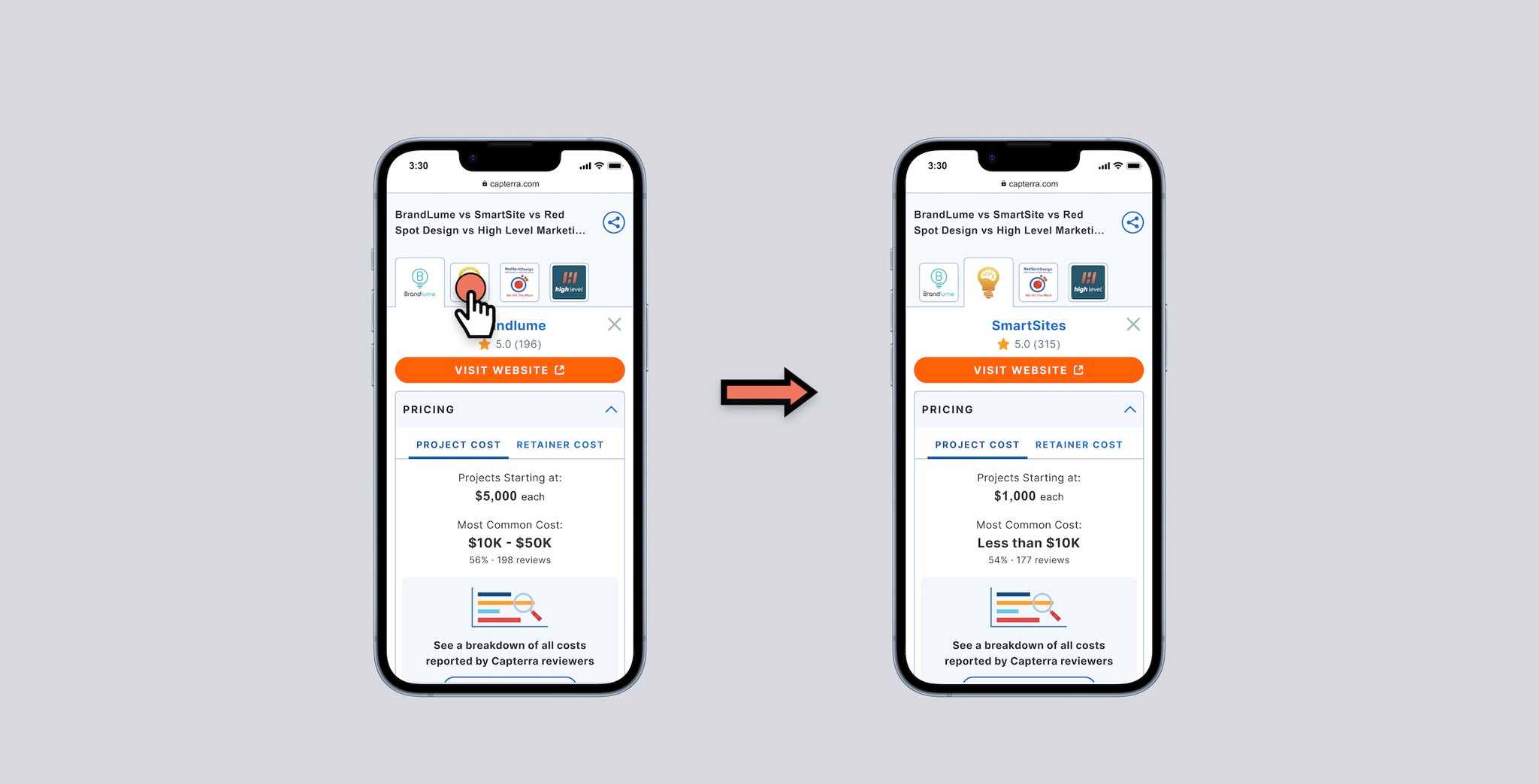
Tab Navigation Experimentation
An alternative exploring the same hypothesis as our toolbar iteration, our tab navigation offers the same benefits of quickly switching between providers in the list.
Tab Navigation Experimentation
An alternative exploring the same hypothesis as our toolbar iteration, our tab navigation offers the same benefits of quickly switching between providers in the list.
Which Iteration Should We Test?
We didn't have the capacity to test both ideas with our users as we had limited time and resources for our remaining prototype tests. This seemed like a great time to lean on the larger UX team to gather feedback on which direction to test.
Which Iteration Should We Test?
We didn't have the capacity to test both ideas with our users as we had limited time and resources for our remaining prototype tests. This seemed like a great time to lean on the larger UX team to gather feedback on which direction to test.

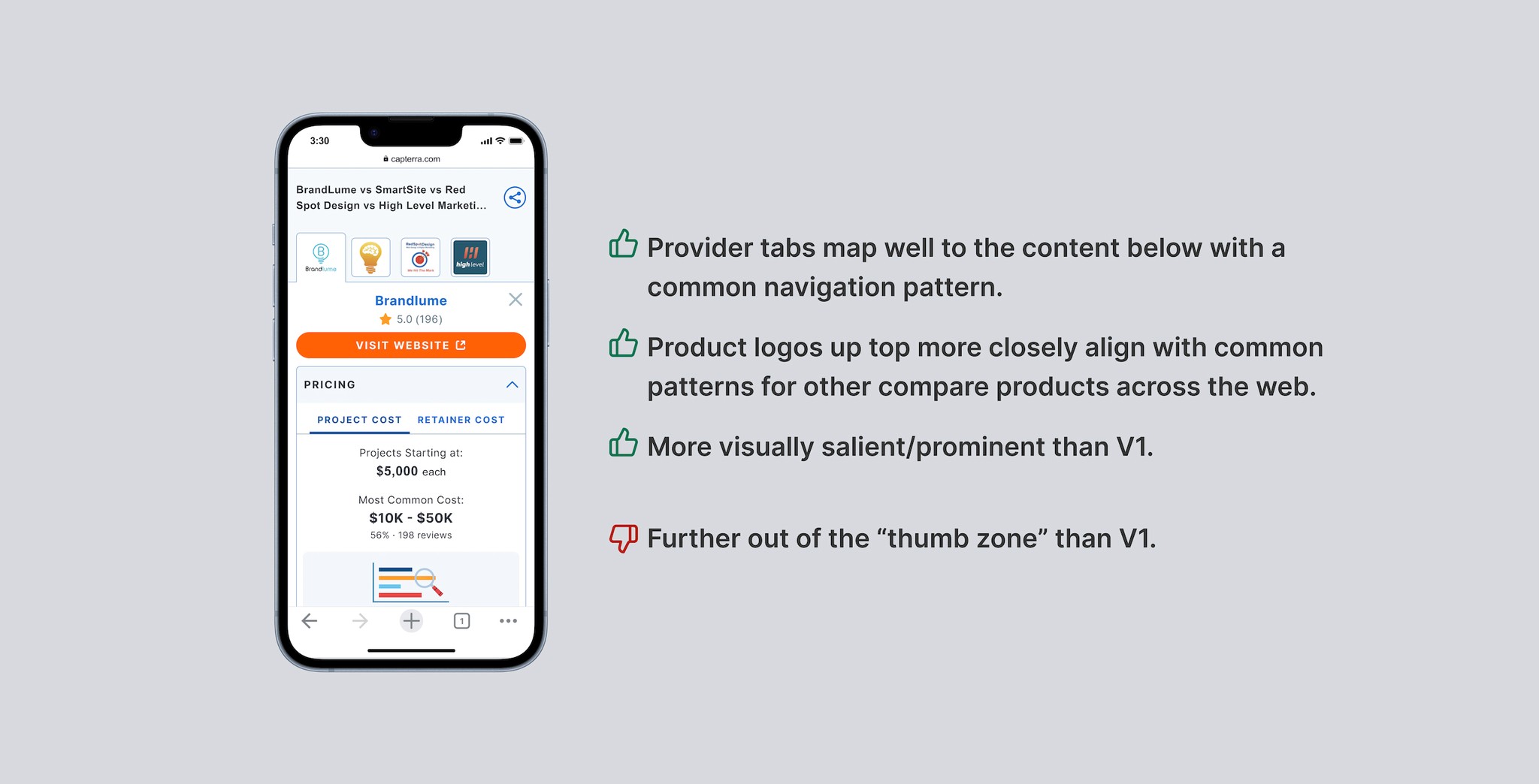
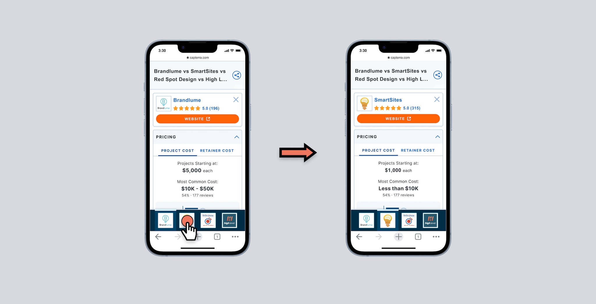
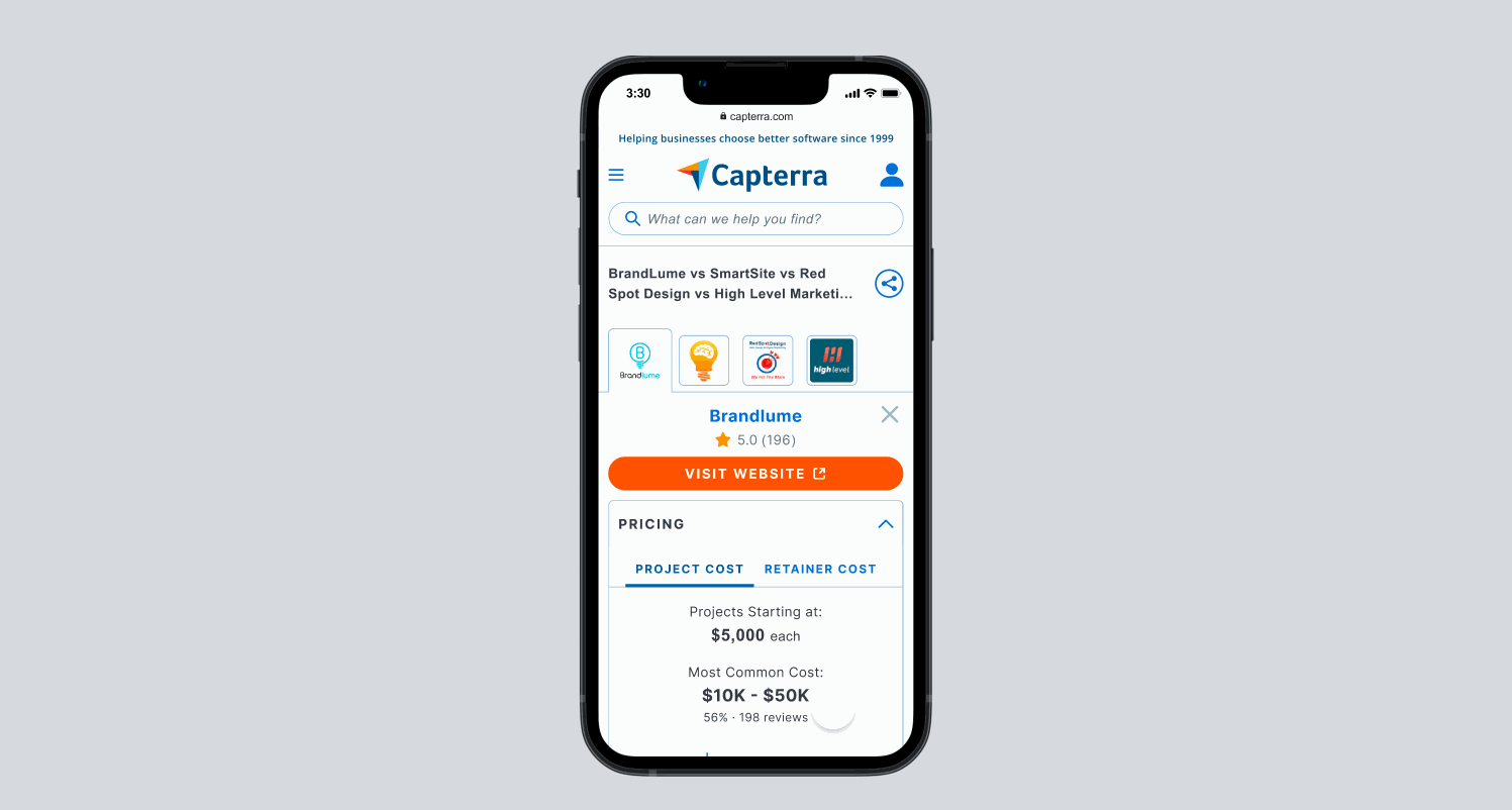
Progressing with Top Tab Designs
After reviewing both versions of the new mobile designs, we decided to proceed with the top tab navigation. This iteration seemed to better fit with our existing pattern system while also matching what we hypothesized to be our user's mental models. To ensure the reliability of our data, we planned to apply the same scenario and questions to a fresh group of participants for our updated designs.
Second Round of Feedback
In our second round of testing, we directed users to explore a new data set using our updated tab navigation layout. This time, instead of concentrating on "Pricing", our focus shifted to "Reviewer Details".
The bulk of the constructive feedback from this session centered on our data presentation. Participants reported that comparing providers was straightforward, and successfully completed their comparison tasks with minimal effort. This feedback underscored the effectiveness of our enhanced tab navigation design.

Adding and Removing Providers
Our participants had validated our new navigation pattern for quickly accessing providers in our mobile comparison designs, but we recognized the need to test one additional aspect with our final test: the process of adding and removing providers from the list.
In this final test, participants were tasked with a scenario: to remove the least preferable provider given a unique set of business requirements. All participants successfully identified the add and remove indicators and completed the task. However, one participant encountered difficulties locating the "remove" X icon. After a thorough discussion, our team opted to maintain the current design for consistency with similar patterns throughout the site. Moving forward, we plan to closely monitor usage metrics through FullStory to identify any potential issues.

Conclusion
Over the course of a single quarter and four rapid prototype tests, as both lead designer and co-researcher, I addressed the unique challenges of mobile comparison tools. Our efforts to refine the mobile experience at Capterra, from conceptualizing to prototyping and testing, led to successful results with our research participants and went on to inform other mobile projects on various Capterra applications. As we move forward we will continue to monitor key business and engagement metrics and will update this case-study accordingly.
Check out the Prototype
Check out the Prototype
